
1. Overview
Welcome to NASA Disasters PORTAL 101!
The NASA Disasters Program advances the access to and application of Earth science information to build communities resilient to disasters and extreme events. Within the program, the Disasters PORTAL is specifically dedicated to improving the awareness, discoverability, and understanding of these data for disaster management communities.
Driven by user feedback, needs, and experience, the NASA Disasters PORTAL aims to maximize partner impact and foster two-way collaboration across the disaster management cycle. The platform provides an intuitive, interactive environment for mapping, data visualizations, analysis, training resources, resilience science, and stories of impact.
Here in Disasters PORTAL 101, you will find page-by-page user guidance, an FAQ section, and Example User Pathways to help you navigate the platform. If you cannot find the answer to your question within this module, please do not hesitate to reach out to us at disasters@nasa.gov.
2. Homepage
The Disasters PORTAL homepage (science.data.nasa.gov/disasters) serves as the main entry point to the platform. From here, users can navigate using the top navigation bar to explore thematic areas and events, read current news and stories, view dynamic data visualizations, access learning resources, and connect with the NASA Disasters Program.
a. Top Level Navigation
Every page across the Disasters PORTAL features the same top navigation bar to ensure a consistent browsing experience.

Clicking the NASA Disasters Program logo in the top left returns you to the Homepage, while the About Us link directs you to the About Us page.
The Explore By Need dropdown features four options corresponding to four key disaster management phases: Prepare, Respond, Recover, and Build Resilience. Selecting any of these options directs you to its respective page.
The Explore Data dropdown provides three options: Data Gallery, Data Visualization, and Data Processing. The Data Gallery option opens the Data Gallery page, and Data Visualization opens the Custom Visualization Tool. As of this soft launch, the Data Processing page is unavailable, though it is planned for a future release.
The Resources & Learning dropdown contains two choices: Training and News, Events & Stories. Each option directs you to its corresponding page.
b. Hero Section
The hero section of the Homepage features cards at the bottom that invite users to navigate to the individual thematic need pages (Prepare, Respond, Recover, and Build Resilience).
c. News, Events & Stories
On the Homepage, the NASA Disasters Program highlights curated news, events and stories. Click on any of the cards to view the content. To see all entries, click “View All” in the top right corner to proceed to the News, Events and Stories page.
d. Data Visualization
The Homepage also features a dynamic data visualization curated by the NASA Disasters Program. While you can interact directly with the data on the page, the full suite of data visualization and analysis capabilities is available through the Custom Visualization Tool.
e. Resources & Learning
On the Homepage, the NASA Disasters Program highlights a curated selection of resources and learning opportunities. Click on any of the cards to view the content. To see all entries, click “View All” in the top right corner to proceed to the Training page.
f. Let’s Connect
From the Homepage, you can subscribe for updates or contact the NASA Disasters Program directly. Clicking “Subscribe for Updates” links you to the Disasters Program Newsletter sign-up page. Selecting “Contact our Team” will prompt you to email the program directly at disasters@nasa.gov.
g. Footer
Each page of the Disasters PORTAL features a consistent Footer. Through it, users can navigate to different parts of the platform, access nasa.gov, review relevant policy information, and view points of contact.
3. About Us
The About Us page provides a high-level overview of the NASA Disasters Program’s mission and introduces leadership of the program. Users can also subscribe for updates or contact the program directly. Clicking “Subscribe for Updates” directs users to the Disasters Program Newsletter sign-up page. Selecting “Contact our Team” will prompt users to email the program directly at disasters@nasa.gov.
4. Explore By Need
On the Disasters PORTAL, there are four thematic need pages: Prepare, Respond, Recover, and Build Resilience. The PORTAL has been designed so that navigation through these pages is the same experience regardless of which theme page you are on.
The Stories of Impact sections are at the top of each thematic need page. These stories serve as an entry point for exploring their respective thematic needs, allowing users to learn more about each topic through a related story and access relevant data, training, or other resources across the PORTAL. Click on any of the cards to view the content. To see all entries, users can click “View All” in the top right corner to proceed to the News, Events & Stories page.
Each thematic need page includes a featured data visualization selected by the NASA Disasters Program to highlight relevant information and datasets. Users can interact with the visualization directly on the page using available controls. For more advanced exploration, visualization, and analysis capabilities, users can access the Custom Visualization Tool.
For the Respond page, the Latest Events section highlights the most recent events supported by the NASA Disasters Response Coordination System (DRCS). Click on any of the cards to view that specific event’s page, which contains overview information about the event, a dynamic data visualization, associated Resources & Learning, and a Data Gallery where data related to the specific event can be found. To view all events, users can click “View All” in the top right corner to proceed to the News, Events & Stories page.
On each thematic need page, Data Stories are curated to be highlighted by the NASA Disasters Program. Data Stories use data-driven storytelling to place visualizations at the center of the experience, supported by narrative content that provides context and interpretation. Click on any of the cards to explore the full story. To see all entries, users can click “View All” in the top right corner to proceed to the News, Events & Stories page.
On each thematic need page, select Resources & Learning opportunities highlighted by the NASA Disasters Program. Click on any of the cards to view the content. To see all entries, users can click “View All” in the top right corner to proceed to the Training page.
5. Data Gallery
The Data Gallery page allows users to explore Earth science data and information produced by the NASA Disasters Program to build disaster-resilient communities. Users can browse data that the NASA Disasters Program has curated, and utilize the search and filter functionality to find specific datasets of interest. Clicking on any of the cards will bring users to a dataset’s landing page, where you can view technical information on the dataset in addition to related content and tags.
6. Custom Visualization Tool
The Custom Visualization Tool is the primary data exploration and analysis platform for the PORTAL, serving as a browser-based extension for users to directly access and interact with data from the NASA Disasters Program. Built on NASA’s Visualization, Exploration, and Data Analysis (VEDA) science cyberinfrastructure, this open-source tool provides a low barrier of entry for exploring data products supplied by the program.
The default view when navigating to the tool showcases various ways to explore data supported by the PORTAL, including Hazard and Event. Users can easily surface specific content via the clickable icons (see below image) located in the left navigation pane.
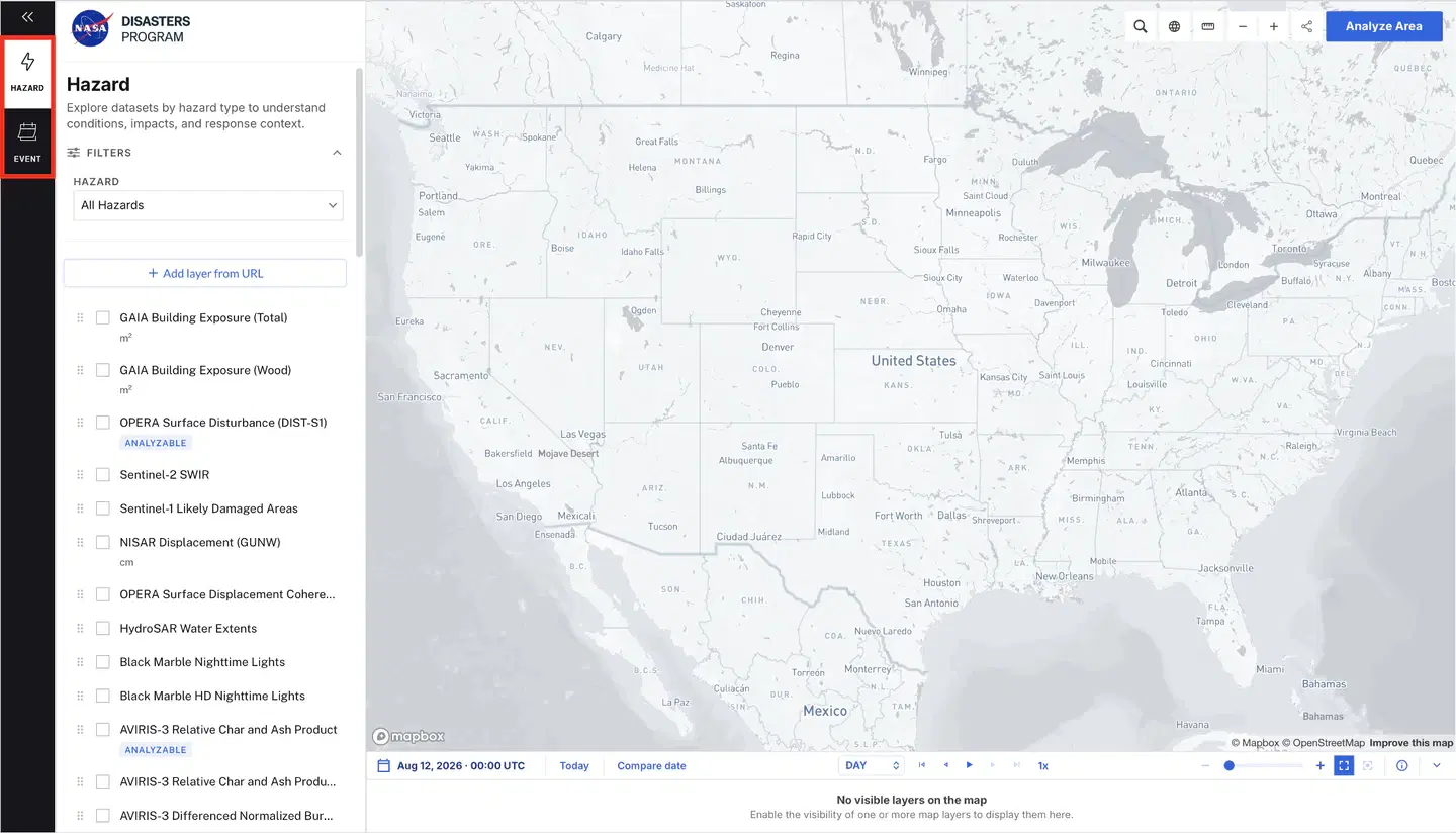
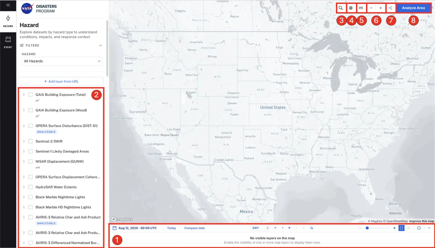
The main components of the Custom Visualization Tool that remain consistent throughout the Hazard and Event-specific content are numbered in the image below.
1. A Timeline component located on the bottom of the page. This component allows users to select a specific time of interest to explore available data products. (See Section 6.1 for more information on the timeline component functionality and capabilities.)
2. Toggleable Data Overlays are located along the left navigation pane. This component allows users to search all available data layers, and filter them by tags specific to the Hazard and Event sub-navigations. Once selected, data availability populates on the tool timeline. Data with temporal information appears as a red bar across its available span. Data without temporal information appears as a grey bar. Users can also reorder data layers by dragging and dropping them.
Items 3 to 6 are the map interaction widgets, grouped above the top right corner of the map.
3. Search Location allows users to query a specific geographic area of interest (AOI), and the map will automatically zoom into that region and denote it with a circular marker.
4. Basemap Style gives users the ability to alter the underlying basemap between streetview, satellite, light mode, dark mode, and an ‘outdoors’ style with terrain contours.
5. Ruler provides a dynamic measurement tool where users can click between two points on a map to return the measurement in both Imperial and Metric units.
6. Zoom In/Out Controls give users further control over their desired zoom extent of the map display. This functionality also exists by using your trackpad or the scroll wheel on your mouse.
7. A Share Map component that allows users to export their working session with all data overlays as a PNG or PDF. This tool also generates a unique URL to share the map view with dataset overlays and temporal/spatial selections saved.
8. A dataset analysis component labeled Analyze Area that provides basic interactive data analysis functionality directly within the Custom Visualization Tool. (See Section 6.2 for more information on the Analyze Area component functionality and capabilities.)
6.1. Timeline Component Functionality and Capabilities
The user-guided Timeline component provides advanced data visualization and analysis capabilities through several interactive features. Using the top-center controls, users can filter, scrub, and playback data. A dynamic calendar in the top-left corner of the tool enables precise date and time selection, while timeline indicators update automatically as different layers are toggled. Users can click directly on the timeline to select a specific timestamp, or zoom in or out by scrolling up or down while hovering over the tool. Additionally, interval buttons (Year, Month, Day, and Hour) in the top-right corner of the tool adjust the tick labels to the desired cadence for optimal clarity. If no data for a given layer is available at the selected time, the Data Overlays pane alerts the user with the message ‘No Data At This Time’. The timeline component also includes a Compare date feature located in the top left of the tool, allowing users to select and analyze two different timestamps of the same data product.

6.2. Analyze Area Component
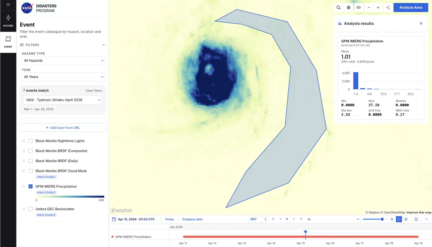
The Analyze Area component includes several built-in features that provide dynamic data visualization and advanced analysis capabilities. Data that can be analyzed will be denoted in the Data Overlays pane with the message ‘Analyzable’. Once selected, its control panel appears in the top-right corner of the Custom Visualization Tool. This panel consists of four main features: Search, Inspect, Draw, and Upload.
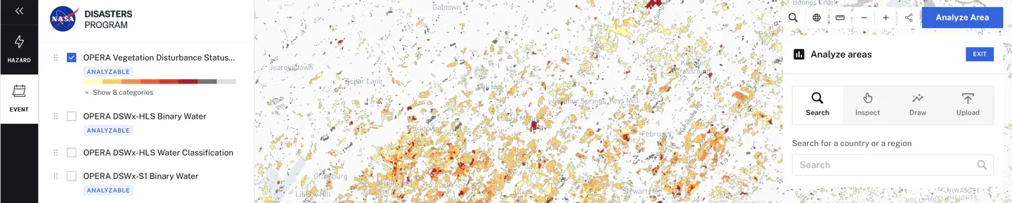
The Search feature operates in the same way as Search Location in Section 6.0, but is currently restricted to state boundaries. Similarly, the Inspect feature allows users to select a state boundary directly from the map rather than querying it by name. The Draw and Upload features both generate polygon-bound AOIs for analysis. Specifically, the Draw feature enables users to sketch squares, circles, or custom shapes on the map, while the Upload feature allows them to import pre-existing AOI polygon shapefiles.
Once a desired location has been selected, a pop-up prompts the user to analyze the area against all valid, active data overlays. After the analysis is complete, a results panel populates below the Analyze Area control panel. This section displays calculated statistics (mean, minimum, maximum, median, standard deviation, 2nd percentile, and 98th percentile) and a bar chart illustrating value distributions. For an example, see the Planet NDVI statistics from the 2025 Texas Flood event pictured below.
6.3. Hazard and Event Sub-Navigations
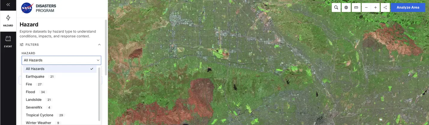
The Hazard sub-navigation is located in the left navigation pane and allows users to filter data overlays by hazard type. Available hazard options are displayed alongside their respective dataset counts, and toggling these options automatically filters the map to show only relevant data overlays. The Event sub-navigation filters data by specific disasters, including tropical cyclones, wildfires, severe weather, floods, and earthquakes. Users can search active and past events using parameters such as Hazard type, Year, or specific tagged event names (e.g., 2025 California Wildfires).
7. Resources & Learning
The Resources & Learning section in the top navigation bar contains two dropdown options: Training and News, Events & Stories.
The Training page aims to empower disaster management communities through relevant, user-driven training resources. Users can easily search, filter, and click on any card to view a training.
The News, Events & Stories page allows users to discover the latest updates, opportunities, and stories highlighting the impact of the NASA Disasters Program. Users can search and filter the content, then click on any card to view the full story, new piece, or event.
8. FAQ
FAQs coming soon! This section will grow as user questions are submitted and answered by the NASA Disasters Program.
9. Example User Pathways
1. Emergency Manager for Event Response
- Access the Homepage by selecting the NASA Disasters Program logo in the top left corner of the page
- Navigate to the Respond page by clicking the Explore by Need dropdown in the top navigation bar
- Explore the Latest Events section and select the specific event or disaster of interest
- Scroll through the Event page to the Related Data section and select the desired data product by clicking the “View Data” button
- Upon reaching the dataset landing page, click “Explore Data” on the left side of the page for further analysis
- The platform will automatically redirect the user to the Custom Visualization Tool, pre-loading the selected dataset
- Click on the Event filter in the left navigation pane and select the specific event or disaster of interest to include all associated data layers
- Toggle and view different situational and data layers associated with the active event
- To integrate a specific layer into a local system, click “View in GIS” to access the corresponding GIS service link or web service
2. Curious, Non-Technical Explorer
- Access the Homepage by selecting the NASA Disasters Program logo in the top left corner of the page
- Navigate to a thematic need page of interest by clicking the Explore by Need dropdown in the top navigation bar
- Scroll through the page and explore the curated Story of Impact cards that link to detailed articles from the NASA Disasters Program
- Review the Data Visualization section of the thematic need page and interact with the featured data product using the slider component
- To find additional resources, click the “Learn More” option on the Data Visualization section, which directs users to Earth science data and information on the Data Gallery page
- If you have remaining questions or want to stay updated, return to the Homepage and select “Connect with Us”
3. Researcher/Data Scientist
- Access the Homepage by selecting the NASA Disasters Program logo in the top left corner of the page
- Navigate to the Data Gallery page by clicking the Explore Data dropdown in the top navigation bar
- Utilize the search functionality to find specific datasets of interest
- Click the “View Data” button to review technical information on the dataset in addition to related content and tags
- Upon reaching the dataset landing page, click “Explore Data” on the left side of the page for further analysis
- The platform will automatically redirect the user to the Custom Visualization Tool, pre-loading the selected dataset
- To integrate a specific layer into a local system, click “View in GIS” to access the corresponding GIS service link or web service